Victory Braze
Strength Through Empowerment
Victory Braze came to us seeking a rebrand that would not only refresh their visual identity but also help them scale their business and reach a broader audience. With their mission rooted in inclusivity and empowerment, they wanted branding that reflected their dedication to helping people excel in fitness and wellness, whether through boxing, running, or power sports.
The brief emphasized a monotone, sleek, and powerful colour palette, with high contrast and dynamic visuals to reflect the modern fitness aesthetic. Keywords including
contemporary, strong, edgy, bold, and elegant guided our approach, ensuring the branding conveyed both power and sophistication.
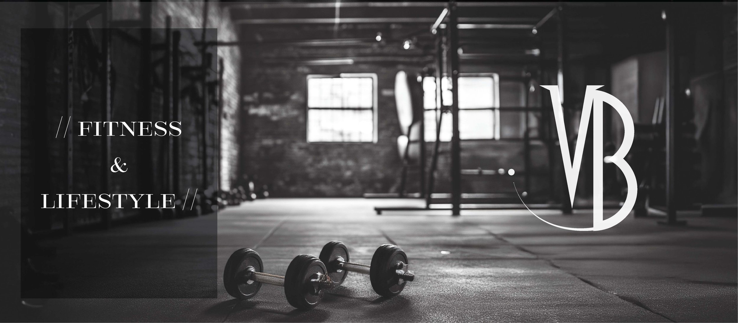
The logo is a defining feature of the rebrand, symbolizing the brand’s energy and resilience. Jagged edges and sharp lines contrast with sleek, curved elements, representing momentum and power, mirroring the movements found in sport.
Typography played a vital role in communicating the brand’s personality:
The primary font is bold and modern, with a distinctive look that captures strength and confidence.
The secondary font complements this with a structured simplicity, adding elegance and balance.
Our rebrand for Victory Braze also involved:
Creating high-contrast imagery and visuals that emphasize inclusivity and empowerment.
Developing a cohesive brand identity to better communicate their message through all touchpoints.
Designing content and materials that seamlessly blend strength with a contemporary edge.
With this refreshed brand identity, Victory Braze achieved measurable growth in audience engagement and business reach, supported by data-driven results.


