Floats
Relaxation in Every Detail
Floats came to us looking for a brand identity that would communicate the unique and soothing experience of their new hydro spa concept. They wanted a design that felt fresh, light hearted, and feminine, capturing the serene essence of the float experience while appealing to their target audience.
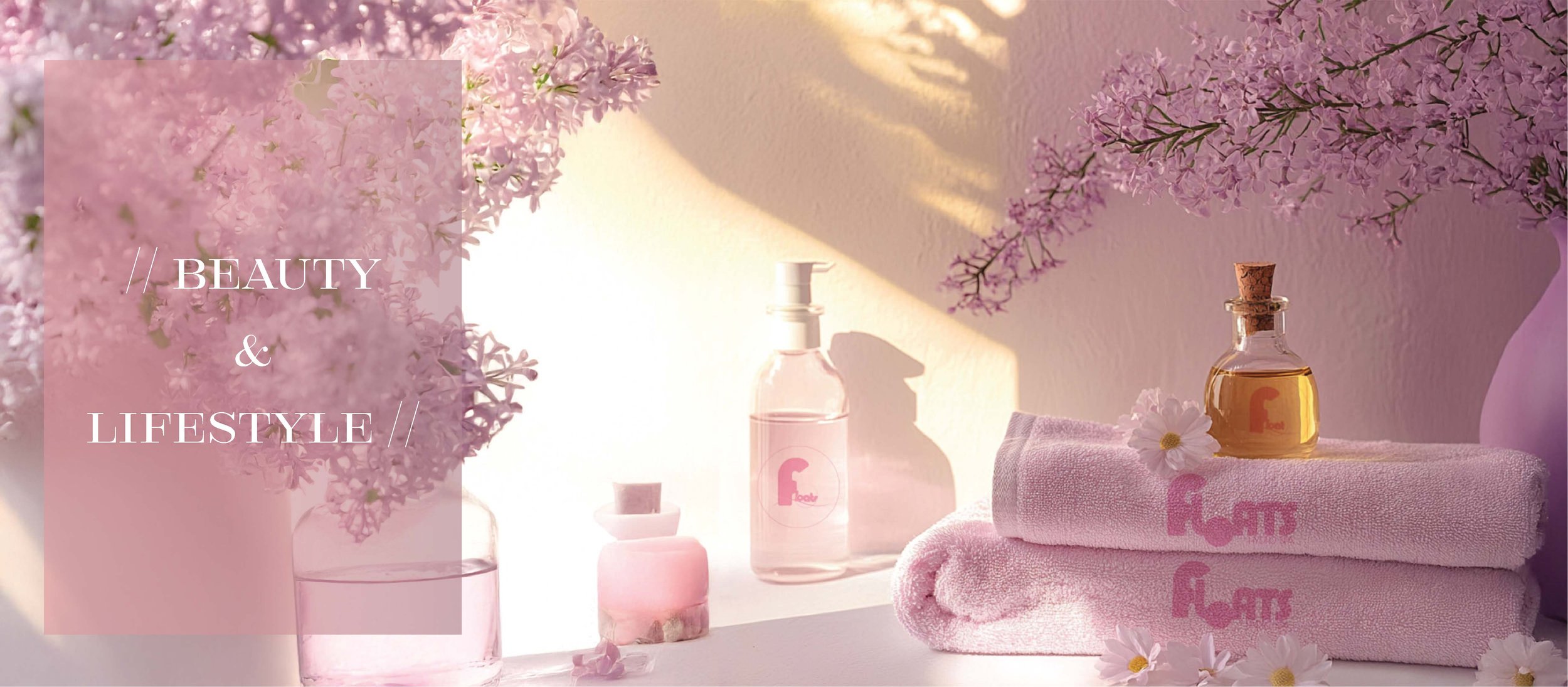
Drawing inspiration from cherry blossom trees and sunsets, we created a visual identity featuring soft pinks and lilacs, with a tranquil and lighthearted tone. To develop the brand identity, we utilized a combination of real imagery and AI-generated visuals, which allowed us to explore different directions and create product mockups for this innovative new concept.
The logo reflects the spa’s ethos of relaxation and calm. Its flowing lines and gentle curves mirror the movement of water, creating a soothing sense of flow and connection. The muted color palette further enhances the serene atmosphere, while the subtle contrasts provide just enough visual interest to draw the eye.
Typography choices reinforce the brand’s concept:
The primary text is light, bubbly, and floaty, perfectly complementing the idea of floating and relaxation.
The secondary font introduces soft contrast, maintaining the brand’s calming and approachable tone.
Our branding process for Floats included:
Creating a color palette and logo that evoke the tranquility of water and nature.
Using AI and real imagery to design product mockups and brand visuals for an immersive launch strategy.
Building a cohesive identity that reflects the spa’s purpose of offering relaxation and rejuvenation.
With this thoughtful brand identity, Floats is poised to deliver a soothing escape for their clients while standing out as a fresh and inviting presence in the wellness industry.


